

The 2nd Must-Have for Independent Authors:
What is the single most important publishing tool for first-time authors?
 I was asked by Orna Ross of Alliance of Independent Authors to share what I consider to be the “Seven Must-Haves for Independent Authors” at UPublishU event that was held at the Book Expo of America 2016 held in Chicago. Of course, I agreed!
However, the Seven Must-Haves are applicable for all authors whether they are self-published, small press published, traditionally published, or hybrid published. Today, I am addressing the second of the Seven Must-Haves for Authors.
What could be almost or maybe more important than the content of a book? THE COVER!
Now don’t get me wrong—content is KING/QUEEN. However, when it comes to selling books, especially for Indie published authors, it is the cover that will rule.
Why is the cover the most important publishing tool for first-time authors?
The cover is what makes a reader who has never heard of you or read your other works pick up your book, or click on the link, or choose your book’s digital thumbprint on Amazon’s Customers Who Bought This Item Also Bought carousel of book covers.
Book covers are so important that major booksellers demand having the final decision in the cover designs of books that they decide to carry so that the covers will appeal to their particular customer demographics.
Key Concepts in Book Cover Design (digital and print)
- Genre placement – the cover should immediately (less than 3 seconds) convey the genre of the book. Is it an intense suspense/thriller novel? or Historical Fiction? Or How-To?
- Category within genre – is it Regency Romance? or Contemporary Women’s Fiction with Southern elements?
- Does the color scheme work with the genre?
- Do the design elements convey an idea of what the story is about?
- Is the cover appealing to the readership that you are targeting?
- Is it dated? Covers can and should be refreshed and tweaked at least every five years.
- Covers should work whether they are enlarged to be 50 feet tall to hang from scaffolding at tradeshows or whether they are reduced to the size of a thumbnail. Keep in mind that cover design may be slightly different for digital and for print. Slightly.
- A book cover is its must important piece of retail real estate. Every inch should be considered for maximum visual and emotional impact.
- Make sure that the entire book’s “packaging” (typography, formatting, fonts, and layout) is co-cohesive and that all of the elements are complementary to each other.
- Color—use color to convey emotion, time period, genre, theme, etc.
Key Elements in Book Cover Design (digital and print)
- Many authors/publishers overlook the spine of their books as a prime selling tool. Since most first time authors’ books will be shelved spine-out instead of front cover out, it is very important to make the spine of your books as appealing as possible to your targeted audience. I recommend that first time authors start the design process from the spine and then move forward to front cover and then the back cover.
- Each design element should convey the story within.
- Typography is part of the cover design and should not be an afterthought. It should enhance the design image of the book and be legible. Resist using the latest curly cues fonts or “urban decay” fonts UNLESS they are easily readable. Do not ever use more than three fonts. If you use one font with a “serif” then you should use a complementary font without a serif.
- Here is an example of a font with serifs (extra flourish): Georgian
-
Here is an example of a font that is sans serif.
- Note – interior copy (the story) should always be printed (digitally or print) with a serif font for ease of readability.
- Here is a link to a Huffington Post on Type Fonts: A Totally Definitive Ranking of Fonts
- A post by Joel Friedlander about picking fonts for self-published books.
Here is a great link to examples of fonts for book covers that will inspire you.
My advice to authors is to begin thinking of your cover concept long before you type The END to your manuscript.
Here are some before and after covers for your consideration. What do you think:
 The Great Symmetry by James Wells before cover
Now ask yourself:
What is the genre of this book?
What is the story about? Is it fiction or non-fiction?
Are you compelled to find out more about what is inside?

The Great Symmetry by James Wells after cover
In less than three seconds, a potential reader can see:
That this is a science fiction novel and the story is action based — the spaceship looks like it is fleeing something and heading into a dangerous place that must be less scary than what it is escaping from.
The primary color is “tech-blue.” Notice how much more pleasing the alignment of the title is and what a difference the typography makes–all caps with a more techie type font. I like how the author’s name and and the book title work together to make a singular visual impression.
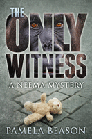
Now you pick, which is the before and which cover is the after for The Only Witness by Pamela Beason

Another example


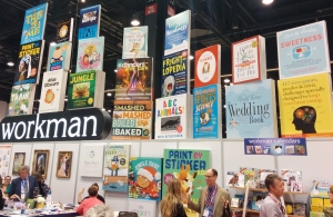
Here are some photos of book spines to drive the point home about their importance and the 3 second rule of thumb.
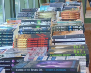
BOOK SPINES MATTER! 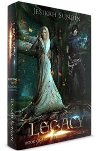
How will your book standout? 
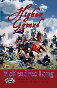
More exceptional cover designs:
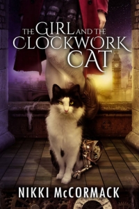 Notice that the reader can immediately tell that this is a steampunk young adult novel that takes place in London, with a young adult female protagonist and a cat. All of this information is conveyed by the cover design.
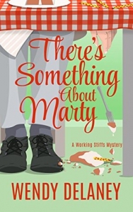 Cozy mystery readers who like a humorous edge to their stories can tell immediately that this book may be of interest to them.
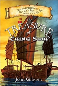 No mistaking that this is a children’s book about sea adventures and pirates!
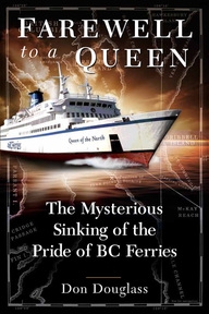
Yep, I read this book to find out what happened to the Queen of the North!
Your cover should incorporate your author brand along with some 3rd party P/R.

Notice how tastefully that this author differentiates himself from the other millions of authors with his designation of being an award winning author.
 You are probably starting to get the concept….of just how much information a cover is able to convey. Help readers discover your books by using your book’s cover real estate as effectively as possible. Make every little detail work for you. Imagine that your cover is a commercial for your book and make each everyone on those three seconds that you have to hook the potential reader into picking up your book instead of someone else’s or to click on your digital cover instead of someone else’s.
Covers can sell readers on your first work, but it is the content that will make them come back for book two and three….
It is the COVER that will sell your books at industry trade shows when book buying professionals pick up your books’ Sell Sheets. Make your books standout and get noticed. Start working on the cover concept almost as soon as you start working on the story concept. Use it start finding Beta readers, on your website, with your author platform to start lining up book signings for your book launch, and planning promotional materials BEFORE your launch date. Keep in mind hour your cover will influence your marketing materials and web promotions.
Remember that it doesn’t matter how much time and money that you spend on getting your book in front of potential readers. If the cover isn’t engaging to the reader, the reader will not pick it up to look at the inside or read the back cover blurb, or click on the image to for more information and all of your time, money, and effort will be for naught.
Covers should convey an emotion first. The cover should have a visual impact that grabs the potential reader and makes him/her want to know more about what is inside. The cover must be enticing!

This is the second blogpost in the Seven Must-Haves for Author series.
The first article addresses:
What is the traditional publishing tool that authors can implement to propel their writing careers to new levels and to earn an income from selling their books? Click here to read.
The third article in the series asks: What is the corner stone of any author platform?
Stay tuned! – Kiffer Brown, Head Hen at Chanticleer Book Reviews


Yes, Kiffer is so right–good covers are crucial. Unfortunately, it’s quite a challenge for indie authors to find cover designers who understand how to create appropriate covers for reasonable prices. Authors need to pay attention to cover trends for their genres, too. Fortunately, Amazon makes it easy–we can just peruse the covers of all the bestsellers in the different categories and look for similarities in style and content.
This was a great article, Kiffer. We strive for excellent cover images. It looks like we succeed with Farewell to a Queen!
Thank you, Kathleen! Yes, you did succeed with Farewell to a Queen!
Thanks, Kiffer — excellent points.
[…] What is the single most important publishing tool for first-time authors? Click here to find out […]